
Scatter Plots
This notebook is an exercise in the Data Visualization course. You can reference the tutorial at this link.
In this exercise, you will use your new knowledge to propose a solution to a real-world scenario. To succeed, you will need to import data into Python, answer questions using the data, and generate scatter plots to understand patterns in the data.
Scenario
You work for a major candy producer, and your goal is to write a report that your company can use to guide the design of its next product. Soon after starting your research, you stumble across this very interesting dataset containing results from a fun survey to crowdsource favorite candies.
Setup
Run the next cell to import and configure the Python libraries that you need to complete the exercise.
import pandas as pd
pd.plotting.register_matplotlib_converters()
import matplotlib.pyplot as plt
%matplotlib inline
import seaborn as sns
print("Setup Complete")
Setup Complete
The questions below will give you feedback on your work. Run the following cell to set up our feedback system.
# Set up code checking
import os
if not os.path.exists("../input/candy.csv"):
    os.symlink("../input/data-for-datavis/candy.csv", "../input/candy.csv")
from learntools.core import binder
binder.bind(globals())
from learntools.data_viz_to_coder.ex4 import *
print("Setup Complete")
Setup Complete
Step 1: Load the Data
Read the candy data file into candy_data. Use the "id" column to label the rows.
# Path of the file to read
candy_filepath = "../input/candy.csv"

# Fill in the line below to read the file into a variable candy_data
candy_data = pd.read_csv(candy_filepath, index_col="id")

# Run the line below with no changes to check that you've loaded the data correctly
step_1.check()
<IPython.core.display.Javascript object>
Correct
# Lines below will give you a hint or solution code
#step_1.hint()
#step_1.solution()
Step 2: Review the data
Use a Python command to print the first five rows of the data.
# Print the first five rows of the data
candy_data.head()
| competitorname | chocolate | fruity | caramel | peanutyalmondy | nougat | crispedricewafer | hard | bar | pluribus | sugarpercent | pricepercent | winpercent | |
|---|---|---|---|---|---|---|---|---|---|---|---|---|---|
| id | |||||||||||||
| 0 | 100 Grand | Yes | No | Yes | No | No | Yes | No | Yes | No | 0.732 | 0.860 | 66.971725 |
| 1 | 3 Musketeers | Yes | No | No | No | Yes | No | No | Yes | No | 0.604 | 0.511 | 67.602936 |
| 2 | Air Heads | No | Yes | No | No | No | No | No | No | No | 0.906 | 0.511 | 52.341465 |
| 3 | Almond Joy | Yes | No | No | Yes | No | No | No | Yes | No | 0.465 | 0.767 | 50.347546 |
| 4 | Baby Ruth | Yes | No | Yes | Yes | Yes | No | No | Yes | No | 0.604 | 0.767 | 56.914547 |
candy_data.info()
<class 'pandas.core.frame.DataFrame'>
Int64Index: 83 entries, 0 to 82
Data columns (total 13 columns):
 #   Column            Non-Null Count  Dtype
---  ------            --------------  -----
 0   competitorname    83 non-null     object
 1   chocolate         83 non-null     object
 2   fruity            83 non-null     object
 3   caramel           83 non-null     object
 4   peanutyalmondy    83 non-null     object
 5   nougat            83 non-null     object
 6   crispedricewafer  83 non-null     object
 7   hard              83 non-null     object
 8   bar               83 non-null     object
 9   pluribus          83 non-null     object
 10  sugarpercent      83 non-null     float64
 11  pricepercent      83 non-null     float64
 12  winpercent        83 non-null     float64
dtypes: float64(3), object(10)
memory usage: 9.1+ KB
The dataset contains 83 rows, where each corresponds to a different candy bar. There are 13 columns:
'competitorname'contains the name of the candy bar.- the next 9 columns (from
'chocolate'to'pluribus') describe the candy. For instance, rows with chocolate candies have"Yes"in the'chocolate'column (and candies without chocolate have"No"in the same column). 'sugarpercent'provides some indication of the amount of sugar, where higher values signify higher sugar content.'pricepercent'shows the price per unit, relative to the other candies in the dataset.'winpercent'is calculated from the survey results; higher values indicate that the candy was more popular with survey respondents.
Use the first five rows of the data to answer the questions below.
# Fill in the line below: Which candy was more popular with survey respondents:
# '3 Musketeers' or 'Almond Joy'?  (Please enclose your answer in single quotes.)
more_popular = '3 Musketeers'

# Fill in the line below: Which candy has higher sugar content: 'Air Heads'
# or 'Baby Ruth'? (Please enclose your answer in single quotes.)
more_sugar = 'Air Heads'

# Check your answers
step_2.check()
<IPython.core.display.Javascript object>
Correct
# Lines below will give you a hint or solution code
#step_2.hint()
#step_2.solution()
Step 3: The role of sugar
Do people tend to prefer candies with higher sugar content?
Part A
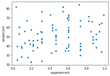
Create a scatter plot that shows the relationship between 'sugarpercent' (on the horizontal x-axis) and 'winpercent' (on the vertical y-axis). Don’t add a regression line just yet – you’ll do that in the next step!
# Scatter plot showing the relationship between 'sugarpercent' and 'winpercent'
sns.scatterplot(x=candy_data['sugarpercent'], y=candy_data['winpercent'])

# Check your answer
step_3.a.check()
<IPython.core.display.Javascript object>
Correct
# Lines below will give you a hint or solution code
#step_3.a.hint()
#step_3.a.solution_plot()
Part B
Does the scatter plot show a strong correlation between the two variables? If so, are candies with more sugar relatively more or less popular with the survey respondents?
step_3.b.hint()
<IPython.core.display.Javascript object>
Hint: Compare candies with higher sugar content (on the right side of the chart) to candies with lower sugar content (on the left side of the chart). Is one group clearly more popular than the other?
# Check your answer (Run this code cell to receive credit!)
step_3.b.solution()
<IPython.core.display.Javascript object>
Solution: The scatter plot does not show a strong correlation between the two variables. Since there is no clear relationship between the two variables, this tells us that sugar content does not play a strong role in candy popularity.
Step 4: Take a closer look
Part A
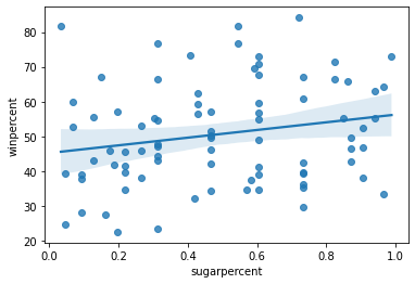
Create the same scatter plot you created in Step 3, but now with a regression line!
# Scatter plot w/ regression line showing the relationship between 'sugarpercent' and 'winpercent'
sns.regplot(x=candy_data['sugarpercent'], y=candy_data['winpercent'])

# Check your answer
step_4.a.check()
<IPython.core.display.Javascript object>
Correct
# Lines below will give you a hint or solution code
#step_4.a.hint()
#step_4.a.solution_plot()
Part B
According to the plot above, is there a slight correlation between 'winpercent' and 'sugarpercent'? What does this tell you about the candy that people tend to prefer?
step_4.b.hint()
<IPython.core.display.Javascript object>
Hint: Does the regression line have a positive or negative slope?
# Check your answer (Run this code cell to receive credit!)
step_4.b.solution()
<IPython.core.display.Javascript object>
Solution: Since the regression line has a slightly positive slope, this tells us that there is a slightly positive correlation between 'winpercent' and 'sugarpercent'. Thus, people have a slight preference for candies containing relatively more sugar.
Step 5: Chocolate!
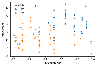
In the code cell below, create a scatter plot to show the relationship between 'pricepercent' (on the horizontal x-axis) and 'winpercent' (on the vertical y-axis). Use the 'chocolate' column to color-code the points. Don’t add any regression lines just yet – you’ll do that in the next step!
# Scatter plot showing the relationship between 'pricepercent', 'winpercent', and 'chocolate'
sns.scatterplot(x=candy_data['pricepercent'], y=candy_data['winpercent'], hue=candy_data['chocolate'])

# Check your answer
step_5.check()
<IPython.core.display.Javascript object>
Correct
# Lines below will give you a hint or solution code
#step_5.hint()
#step_5.solution_plot()
Can you see any interesting patterns in the scatter plot? We’ll investigate this plot further by adding regression lines in the next step!
Step 6: Investigate chocolate
Part A
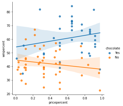
Create the same scatter plot you created in Step 5, but now with two regression lines, corresponding to (1) chocolate candies and (2) candies without chocolate.
# Color-coded scatter plot w/ regression lines
sns.lmplot(x='pricepercent', y='winpercent', hue='chocolate', data=candy_data)

# Check your answer
step_6.a.check()
<IPython.core.display.Javascript object>
Correct
# Lines below will give you a hint or solution code
#step_6.a.hint()
#step_6.a.solution_plot()
Part B
Using the regression lines, what conclusions can you draw about the effects of chocolate and price on candy popularity?
step_6.b.hint()
<IPython.core.display.Javascript object>
Hint: Look at each regression line - do you notice a positive or negative slope?
# Check your answer (Run this code cell to receive credit!)
step_6.b.solution()
<IPython.core.display.Javascript object>
Solution: We’ll begin with the regression line for chocolate candies. Since this line has a slightly positive slope, we can say that more expensive chocolate candies tend to be more popular (than relatively cheaper chocolate candies). Likewise, since the regression line for candies without chocolate has a negative slope, we can say that if candies don’t contain chocolate, they tend to be more popular when they are cheaper. One important note, however, is that the dataset is quite small – so we shouldn’t invest too much trust in these patterns! To inspire more confidence in the results, we should add more candies to the dataset.
Step 7: Everybody loves chocolate.
Part A
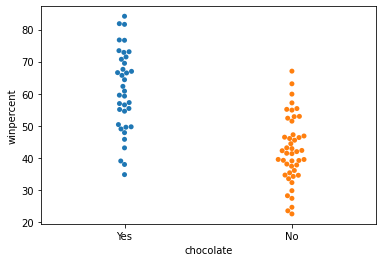
Create a categorical scatter plot to highlight the relationship between 'chocolate' and 'winpercent'. Put 'chocolate' on the (horizontal) x-axis, and 'winpercent' on the (vertical) y-axis.
# Scatter plot showing the relationship between 'chocolate' and 'winpercent'
sns.swarmplot(x=candy_data['chocolate'], y=candy_data['winpercent'])

# Check your answer
step_7.a.check()
<IPython.core.display.Javascript object>
Correct
# Lines below will give you a hint or solution code
#step_7.a.hint()
#step_7.a.solution_plot()
Part B
You decide to dedicate a section of your report to the fact that chocolate candies tend to be more popular than candies without chocolate. Which plot is more appropriate to tell this story: the plot from Step 6, or the plot from Step 7?
step_7.b.hint()
<IPython.core.display.Javascript object>
Hint: Which plot communicates more information? In general, it’s good practice to use the simplest plot that tells the entire story of interest.
# Check your answer (Run this code cell to receive credit!)
step_7.b.solution()
<IPython.core.display.Javascript object>
Solution: In this case, the categorical scatter plot from Step 7 is the more appropriate plot. While both plots tell the desired story, the plot from Step 6 conveys far more information that could distract from the main point.
Keep going
Explore histograms and density plots.
Have questions or comments? Visit the course discussion forum to chat with other learners.

Leave a comment